Two complete stylesheets to start from if you turn off the plugin’s default styles and write your own CSS instead.
If you check “Disable default styles” on the Styling page, the related-posts block still renders the exact same markup, it just has no CSS attached to it at all. Until you add your own, it shows up as an unstyled list of links. The two stylesheets below are complete, working starting points, not fragments to guess at.
Where this CSS goes
Paste either one into Appearance → Customize → Additional CSS, WordPress’s own built-in CSS editor. The plugin doesn’t have its own separate CSS field. Save, and it applies immediately.
One rule worth knowing before you edit either one
Each related-post card has an invisible link layered over the whole card so “click anywhere on the card” works, while the category and tag links inside the card stay independently clickable on top of it. That only works because the card itself is position: relative and the invisible link is position: absolute; inset: 0;. If you remove or override position: relative on the card while customizing further, clicking the card stops working, even though nothing looks different.
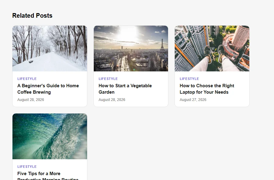
Option A: Clean Cards
A grid of bordered cards with an image, a category label, a title, and a subtle hover lift. Works well as an end-of-post block on most sites.
.arp-block { margin: 2.5em 0; }
.arp-block-heading { font-size: 1.25rem; font-weight: 700; margin: 0 0 1em; }
.arp-card-list { display: grid; grid-template-columns: repeat(auto-fill, minmax(220px, 1fr)); gap: 20px; list-style: none; margin: 0; padding: 0; }
.arp-card { position: relative; background: #fff; border: 1px solid #e2e2e2; border-radius: 12px; overflow: hidden; transition: box-shadow .2s ease, transform .2s ease; }
.arp-card:hover { box-shadow: 0 10px 24px rgba(0,0,0,.08); transform: translateY(-3px); }
.arp-card-permalink { position: absolute; inset: 0; z-index: 1; }
.arp-card-link { display: block; }
.arp-card-image { display: block; position: relative; }
.arp-card-image img { width: 100%; height: 150px; object-fit: cover; display: block; }
.arp-card-badge { position: absolute; top: 10px; left: 10px; background: #1a1a1a; color: #fff; font-size: 12px; font-weight: 700; width: 24px; height: 24px; border-radius: 50%; display: flex; align-items: center; justify-content: center; z-index: 2; }
.arp-card-body { display: block; padding: 14px 16px 16px; }
.arp-card-eyebrow { position: relative; z-index: 2; display: inline-block; font-size: 11px; font-weight: 700; text-transform: uppercase; letter-spacing: .04em; color: #6c5ce7; text-decoration: none; margin-bottom: 6px; }
.arp-card-title { display: block; font-size: 15px; font-weight: 600; line-height: 1.4; color: #1a1a1a; }
.arp-card-meta { position: relative; z-index: 2; display: block; margin-top: 8px; font-size: 12px; color: #767676; }
.arp-card-meta a { position: relative; z-index: 2; color: #767676; text-decoration: none; }
.arp-card-meta-sep { margin: 0 6px; }
.arp-card-excerpt { display: block; margin-top: 8px; font-size: 13px; line-height: 1.5; color: #555; }
.arp-card-cta { position: relative; z-index: 2; display: inline-block; margin-top: 10px; font-size: 13px; font-weight: 600; color: #6c5ce7; }
What that produces, using the plugin’s real markup and card content:
Option B: Compact List
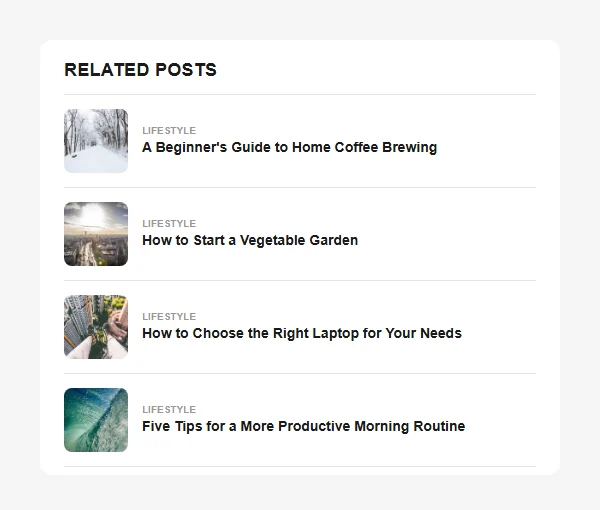
A tighter, row-based layout with a small square thumbnail, a category label, and a title. Better suited to a sidebar, a narrower content column, or a site that wants related posts to feel like a quiet footnote rather than a second feature block.
.arp-block { margin: 2.5em 0; background: #fff; border-radius: 12px; padding: 20px 24px 8px; }
.arp-block-heading, .arp-block-heading-inner { font-size: 1.1rem; font-weight: 700; margin: 0 0 0.75em; text-transform: uppercase; letter-spacing: .03em; color: #1a1a1a; }
.arp-card-list { list-style: none; margin: 0; padding: 0; border-top: 1px solid #e5e5e5; }
.arp-card { position: relative; display: flex; align-items: center; gap: 14px; padding: 14px 0; border-bottom: 1px solid #e5e5e5; }
.arp-card-permalink { position: absolute; inset: 0; z-index: 1; }
.arp-card-link { display: flex; align-items: center; gap: 14px; width: 100%; }
.arp-card-image { flex: 0 0 auto; display: block; }
.arp-card-image img { width: 64px; height: 64px; object-fit: cover; border-radius: 8px; display: block; }
.arp-card-badge { position: absolute; top: -4px; left: -4px; background: #1a1a1a; color: #fff; font-size: 11px; font-weight: 700; width: 20px; height: 20px; border-radius: 50%; display: flex; align-items: center; justify-content: center; z-index: 2; }
.arp-card-body { flex: 1 1 auto; min-width: 0; }
.arp-card-eyebrow { position: relative; z-index: 2; display: block; font-size: 10px; font-weight: 700; text-transform: uppercase; color: #999; text-decoration: none; margin-bottom: 2px; }
.arp-card-title { display: block; font-size: 14px; font-weight: 600; line-height: 1.35; color: #1a1a1a; }
.arp-card-meta { position: relative; z-index: 2; display: block; margin-top: 4px; font-size: 11px; color: #999; }
.arp-card-meta a { position: relative; z-index: 2; color: #999; text-decoration: none; }
.arp-card-meta-sep { margin: 0 4px; }
.arp-card-excerpt { display: none; }
.arp-card-cta { display: none; }
Note the explicit white background on .arp-block itself. Without it, the list inherits whatever background color sits behind it, and on a dark theme the dark title text becomes unreadable. Giving the block its own fixed surface keeps it legible regardless of what it’s placed on.
Mixing and adjusting
Both options use the same class names, so it’s fine to take the image handling from one and the typography from the other, or drop in your own colors and spacing throughout. The only rule that actually matters structurally is the one above: keep .arp-card as position: relative and leave .arp-card-permalink as an absolutely-positioned empty link, or the whole-card click stops working.